Priceline
Homepage and Brand Refresh

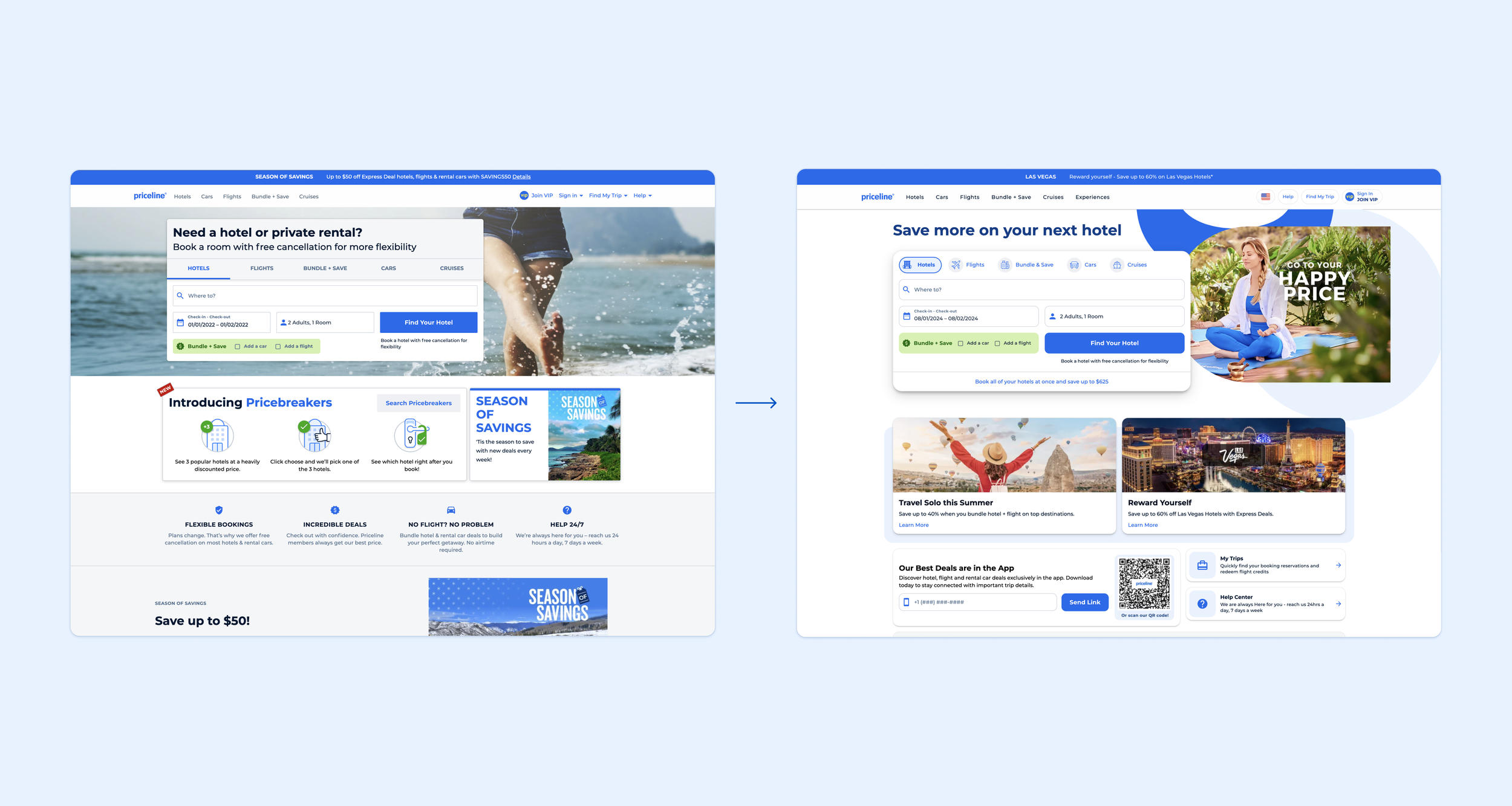
Priceline is an online travel agency with a mission to be the best travel dealmakers in the world. The Homepage needed a refresh, which in turn extended to all touch-points.
When an ask came in to update the look and feel of the homepage, another apparent opportunity arose– to infuse consistency, personality, and more modern UI elements throughout pre- and post-booking touchpoints. This project spanned teams and required cross-functional collaboration along the way. This project also included updates to the Priceline design system, further scaling this initiative from the homepage across the entire website and app.
Role
Product Design
while Sr. Product Designer at Priceline
Skills Utilized
User research and testing
Mood-boarding
Creative design thinking
Cross-functional collaboration
Iterative UX and UI design for A/B testing
Project Highlight
+22%
Click-thru rate on email
Exploration and Inspiration
The Priceline website was functional and familiar to existing users, but lacked delight and personality. From an extensive round of exploration, we decided to bring in:
Modernized UI patterns
Bright pops of color
Interesting use of shapes
Finding Shape
To bring visual interest and a common pattern, we looked to the heart of the brand for inspiration. The Priceline logo was distilled down to a set of key shapes to utilize in our bolder, more modern UI.
Defining a Pattern
The logo’s swoops, circles, and arches are all used in our refreshed approach. We created selection of shape lock-ups to utilize to highlight key functions & pieces of information.

Scaling Across the Site
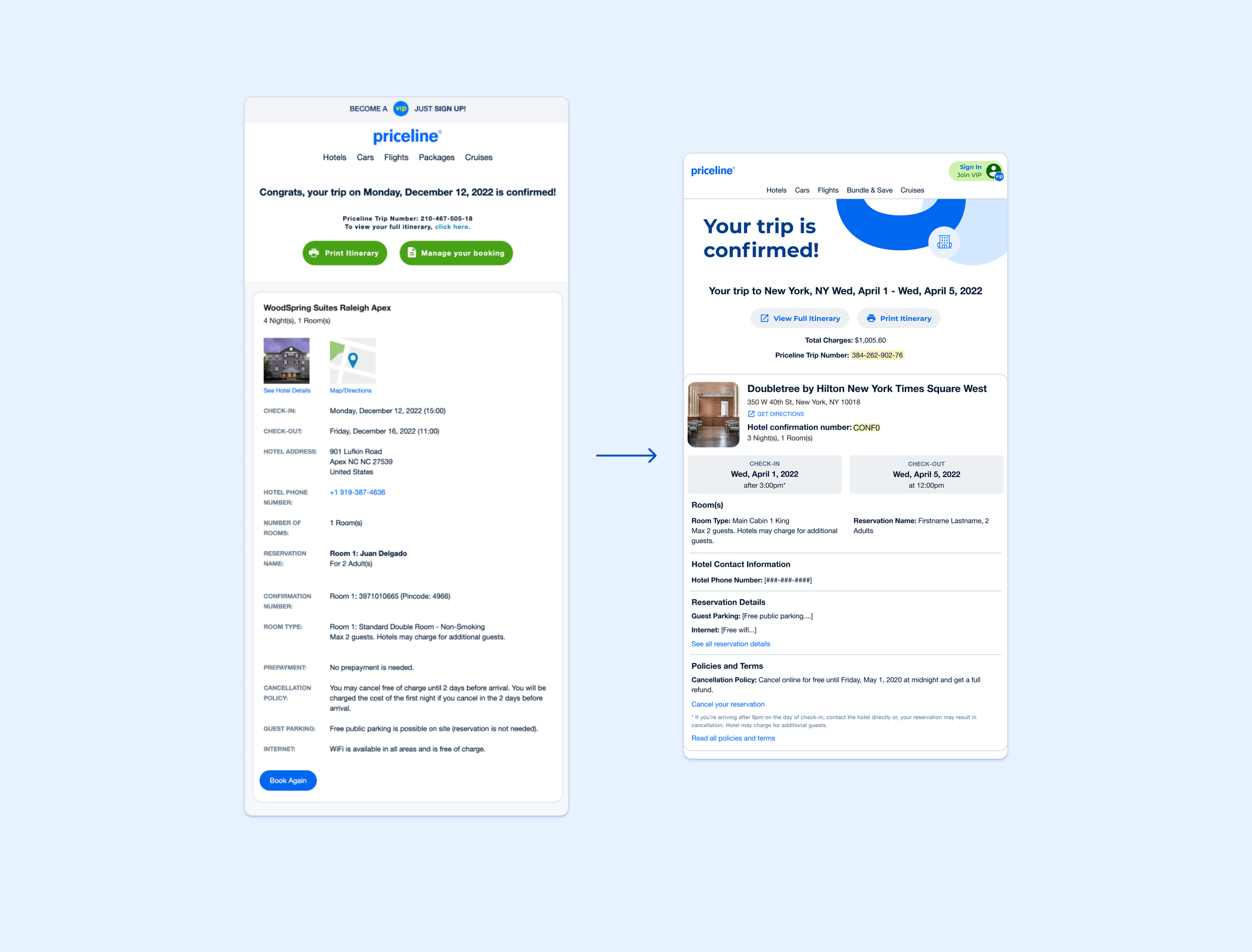
I drove the initiative to bring these updated styles to our confirmation pages via a series of iterative A/B tests. Card styles, text and button styles were all updated. A silhouette of the key shapes, seen above, was also tested – this addition saw an average 92% win probability & a notable increase in net incremental bookings per day.
Scaling into Marketing
The refresh was applied to the confirmation email template, including:
Addition the silhouette shapes in the header
Improved information hierarchy
Updated styling of core components
We saw fantastic results from this email update, with a +22% CTR on email & +18.5% orders per email.

Measuring Success
92%
Win Probability on the confirmation page
+22%
CTR on email
+18.5%
Orders per email
😊
Increase in positive user sentiment


